Frover - Muti-Purpose WordPress Theme
By Progression Studios
Thank you for purchasing this template. If you have any questions that are beyond the scope of this help file, visit our support forum.
Recommended Image Sizes
Below are recommended image sizes. You can adjust these though as you like, they are only recommendations
- Homepage Slider: 1800 pixels wide x 800 pixels tall
- Portfolio Images: 1200 pixels wide x 600 pixels tall
- Blog Image: 1140 pixels wide x 575 pixels tall
The suggested image sizes might be larger than you would expect. You can always adjust the image size down if you want to have smaller file sizes.
Logo & Navigation
Changing the logo
Changing out your logo is simple. I've included a Photoshop template, /Additional Files/Templates/logo.psd that is 360 pixels wide by 214 pixels tall. (Though resized on the site to 180px wide) You can just save over the current images/logo.png file.
Logo Width: If you use a logo width other than 180 pixels. You will need to adjust this in the style.css file under section "02. COLORS AND FONTS":
/*
=============================================== 02. COLORS AND FONTS ===============================================
*/
/* -------------------- A. LOGO WIDTH -------------------- */
body #logo, body #logo img {width:180px;}
In addition, you will adjust the the .html files via the width parameter:
<h1 id="logo"><a href="index.html"><img src="images/demo/logo.png" alt="logo" width="180"></a></h1>
Logo Height: The logo can be any height.
Adjust the Navigation Height

If your logo height is too tall, it may change the position of the main navigation. You can easily adjust this by editing the style.css file. Section "02. COLORS AND FONTS", sub-section "A. LOGO WIDTH"
/*
=============================================== 02. COLORS AND FONTS ===============================================
*/
/* -------------------- A. LOGO WIDTH -------------------- */
.sf-menu a {padding: 16px 14px 16px 14px;}
Adjust to a larger number for space.
To adjust the height of the page title, you'll need to edit a similar CSS code:
#page-title h1 {
padding: 38px 0px;
}
Marking a Navigation Item as Selected
The navigation is setup to be easily selectable. For example, the Contact page will show the Contact link in the navigation with a darker font color. Just add a class of "current-menu-item" to the navigation list item and it will show as selected. For example:
	<li>
		<a href="index.html">Home</a>
	</li>
	<li class="current-menu-item">
		<a href="about.html">About us</a>
	</li>
	<li>
		<a href="menu.html">Menu</a>
	</li>
HTML Samples
Aligning Images Left, Right, and Center
Any images that are on the website by default will align with the text. Add a div with a class of "aligncenter", "alignright", and "alignleft" to float any of the images. For example:
<img class="alignright" src="images/demo/photo.jpg" width="140" height="103" />
Creating buttons
The default button is created by just adding one class to a text link. All of the background images and hover effects are added automatically! For Example:
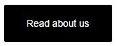
<a href="http://www.google.com" class="progression-button">Read about us</a>
Slider Demo
See blog.html page for example of the secondary slider (flexslider) or for the "Revolution Slider", check the index.html page, and the "Featured Slider" section of the documentation for further details.
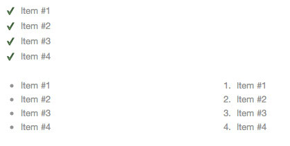
Styling List Items
Lists can be styled by adding a simple class of "checkmark", or as just normal <ul> <ol>.
	<ul class="checkmark">
		<li>Maecenas malesuada purus</li>
		<li>Varius volutpat a a ante</li>
		<li>Donec in ante sit amet ligul</li>
		<li>Mollis porta sit amet ac est</li>
	</ul>
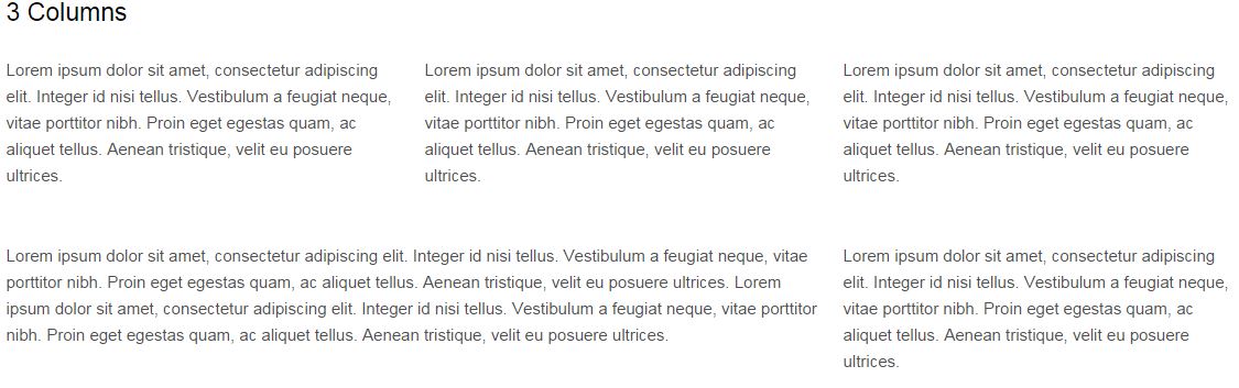
Column Layouts
The column layouts are very easy since we are using a grid system. You can use the same column divs on a full width page or a page with a sidebar. See the Columns pages for an example on how to implement various sizes.
Note: After a set of columns, add <div class="clear"></div> to fix any divs from floating into each other on the next row. Also, add the class of omega for the last element in a row, and alpha for the first one
	<div class="ls-sc-grid_2 alpha">
		<h5>1/2</h5>
		<p>Lorem ipsum dolor sit amet</p>
	</div>

	<div class="ls-sc-grid_2 omega">
		<h5>1/2</h5>
		<p>Lorem ipsum dolor sit amet</p>
	</div>

	<div class="clear"></div>
To check the different types of width you can use in the grid, you can refer to the style.css page:
.ls-sc-grid_1 {
  width: 6.333%;
}
.ls-sc-grid_2 {
  width: 14.667%;
}
.ls-sc-grid_3 {
  width: 23.0%;
}
.ls-sc-grid_4 {
  width: 31.333%;
}
.ls-sc-grid_5 {
  width: 39.667%;
}
.ls-sc-grid_6 {
  width: 48.0%;
}
.ls-sc-grid_7 {
  width: 56.333%;
}
.ls-sc-grid_8 {
  width: 64.667%;
}
.ls-sc-grid_9 {
  width: 73.0%;
}
.ls-sc-grid_10 {
  width: 81.333%;
}
.ls-sc-grid_11 {
  width: 89.667%;
}
.ls-sc-grid_12 {
  width: 98.0%;
}
Toggles, Tabs, Highlights and Dividers
To create different types of Toggles, Tabs, Highlights or Dividers, you could take a look and follow these examples:

Toggles -
					<h4>Toggle</h4>
						<div class="ls-sc-toggle ">
							<h3 class="ls-sc-toggle-trigger">Toggle Title</h3>
							<div class="ls-sc-toggle-container">Toggle text</div>
						</div>
Tabs -
						<div class="ls-sc-tabs ui-tabs ui-widget ui-widget-content ui-corner-all">
							<ul class="ui-tabs-nav ls-sc-clearfix ui-helper-reset ui-helper-clearfix ui-widget-header ui-corner-all" role="tablist">
								<li class="ui-state-default ui-corner-top ui-tabs-active ui-state-active" role="tab" tabindex="0" aria-controls="ls-sc-tab-tab-1" aria-labelledby="ui-id-1" aria-selected="true">
									<a href="#ls-sc-tab-tab-1" class="ui-tabs-anchor" role="presentation" tabindex="-1" id="ui-id-1">Tab #1</a>
								</li>
								<li class="ui-state-default ui-corner-top" role="tab" tabindex="-1" aria-controls="ls-sc-tab-tab-2" aria-labelledby="ui-id-2" aria-selected="false">
									<a href="#ls-sc-tab-tab-2" class="ui-tabs-anchor" role="presentation" tabindex="-1" id="ui-id-2">Tab #2</a>
								</li>
							</ul>
							<div id="ls-sc-tab-tab-1" class="tab-content  ui-tabs-panel ui-widget-content ui-corner-bottom" aria-labelledby="ui-id-1" role="tabpanel" aria-expanded="true" aria-hidden="false">Tab 1 text</div>
							<div id="ls-sc-tab-tab-2" class="tab-content  ui-tabs-panel ui-widget-content ui-corner-bottom" aria-labelledby="ui-id-2" role="tabpanel" aria-expanded="false" aria-hidden="true">Tab 2 text</div>
						</div>
Highlights -
<p>Lorem ipsum dolor sit amet, <span class="ls-sc-highlight green ">consectetur adipiscing elit</span>. Cras rhoncus, diam quis luctus pellentesque, odio est condimentum leo, nec accumsan orci augue commodo enim. <span class="ls-sc-highlight red ">Proin cursus sollicitudin magna eget ultricies</span>.</p>
Dividers -
<hr class="ls-sc-divider dashed yellow " >

<hr class="ls-sc-divider double green " >

<hr class="ls-sc-divider solid blue">
CSS Files (Color Scheme)
General CSS Information
We are using two types of css files.
- style.css (Default Styles)
- /css/responsive.css (Responsive Styling)
Adjusting Color Schemes and Fonts
All of the color scheme adjustments are edited in the style.css file.
/*
=============================================== 02. COLORS AND FONTS ===============================================
*/
Each of the color adjustment sections are labelled and easy to edit via the 6 digit hex color code:
/* -------------------- B. BACKGROUND COLORS -------------------- */
Example of changing the Navigation Background Color
Adjusting the navigation background color is easy: Start by opening up the style.css file.
Next find the corresponding section titled "B. BACKGROUND COLORS"
header {background-color:#ffffff;}

Edit the 6 digit color code to what you want. Note: If you have trouble finding color codes, use this website http://www.colorpicker.com.
/* -------------------- B. BACKGROUND COLORS -------------------- */
header {background-color:#d10000;}
Changing the template's fonts
All of the font-families are designed in the style.css file under the section "02. COLORS AND FONTS".
It is near the top of the stylesheet here:
	/* -------------------- D. FONT FAMILIES -------------------- */
body, body #main form.woocommerce-ordering select {
	font-family: 'Raleway', sans-serif;
}
Additional Styling Options
You can find additional color scheme options in the main stylesheet style.css. Just look in the table of contents at the top to find the correct styling:
/*  Table of Contents
01. HTML5 ✰ BOILERPLATE RESET FILE
02. COLORS AND FONTS
	A. LOGO WIDTH
	B. BACKGROUND COLORS
	C. FONT COLORS
	D. FONT FAMILIES
03. PRIMARY STYLES
	A. DEFAULT STYLES
	B. CSS3 TRANSITIONS
04. MAIN CONTAINERS
05. HOMEPAGE STYLES
06. FOOTER STYLES
07. BLOG STYLES
08. SIDEBAR & WIDGET STYLES
09. PORTFOLIO STYLES
10. DEFAULT GRID
11. BUTTON STYLES
12. CONTACT FORM STYLES
13. REVOLUTION SLIDER
14. SLIDER and PAGE TITLE
15. NAVIGATION
16. WOOCOMMERCE STYLES
17. FONT AWESOME
18. LIGHTBOX STYLES
*/
JavaScript Files
This template imports five main types of Javascript files.
- Modernizr - modernizr-2.6.2.min.js
- jQuery
- plugins.js containing all javascript plugins (Slider, Lightbox, and etc.)
- scripts.js containing all javascript scripts (Hover Effects, Menu Drop Down, and etc.)
Adjusting Transprency on Images
The transparency is adjusted via a javascript plugin called Transify. You can adjust the opacity as needed or remove the transparency.
You can do this in the /js/script.js file at the bottom:
/*
=============================================== 06. TRANPARENT SLIDER BUTTON + PORTFOLIO  ===============================================
*/
jQuery(document).ready(function($) {
	 'use strict';
	$('.portfolio-index-padding').transify({opacityOrig:0.8, percentWidth:'100%'});
});
Learn how to use this plugin more here: http://jorenrapini.com/blog/css/transify-a-jquery-plugin-to-easily-apply-transparency-opacity-to-an-elements-background
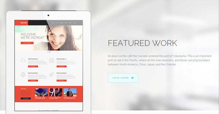
Featured Sliders
We use two kinds of responsive sliders, one for the homepage, and one for general posts or pages. The premium 'Revolution Slider' plugin is used for the Homepage templates: http://themepunch.com/revolution/.
The secondary slider used throughout this template is Flex Slider.
Using the Revolution Slider (Homepage Slider)
The Revolution Slider is fairly easy to use. You can add slides by adding simple list items, and add as many captions as you want. Also, you can surround the image with a link and easily add a link. Here is a (partial) example of the homepage slider code.
	<div id="pro-home-slider"><!-- START REVOLUTION SLIDER -->
	<div id="rev_slider_1_1_wrapper" class="rev_slider_wrapper fullwidthbanner-container">
		<div id="rev_slider_1_1" class="rev_slider fullwidthabanner">
The above section is the main wrapper of the homepage slider. Bellow is an example of adding the first slide into the slider. The image is located in the img tag, while the captions are layered in three layers, which are loaded separately:
		<ul>
			<!-- SLIDE  -->
			<li data-transition="zoomin" data-slotamount="7" data-masterspeed="300" data-thumb="images/demo/new-slide-1.jpg"  data-saveperformance="off"  data-title="Slide 1">
				<!-- MAIN IMAGE -->
				<img src="rs-plugin/images/dummy.png"  alt="sample-image47" data-lazyload="images/demo/new-slide-1.jpg" data-bgposition="center top" data-bgfit="cover" data-bgrepeat="no-repeat">

			<!-- LAYERS -->

			<!-- LAYER NR. 1 -->
			<div class="tp-caption pro-heading-blue customin fadeout tp-resizeme"
				data-x="800"
				data-y="center" data-voffset="-115"
				data-customin="x:0;y:0;z:0;rotationX:0;rotationY:0;rotationZ:0;scaleX:0.75;scaleY:0.75;skewX:0;skewY:0;opacity:0;transformPerspective:600;transformOrigin:50% 50%;"
				data-speed="300"
				data-start="250"
				data-easing="Power4.easeInOut"
				data-splitin="none"
				data-splitout="none"
				data-elementdelay="0.1"
				data-endelementdelay="0.1"
				data-endspeed="200"
				>
			WELCOME TO FROVER
			</div>

			<!-- LAYER NR. 2 -->
			<div class="tp-caption pro-text-blue tp-fade tp-resizeme"
				data-x="130"
				data-y="bottom" data-voffset="-177"
				data-speed="300"
				data-start="1200"
				data-easing="Power1.easeIn"
				data-splitin="none"
				data-splitout="none"
				data-elementdelay="0.1"
				data-endelementdelay="0.1"
				data-endspeed="300"
				>It is curious to recall some of the mental habits of those departed days. At most terrestrial men fancied there might be other men upon Mars, perhaps inferior to themselves and ready to welcome.
			</div>

			<!-- LAYER NR. 3 -->
			<div class="tp-caption pro-blank small_light_white  tp-fade tp-resizeme"
				data-x="130"
				data-y="bottom" data-voffset="-70"
				data-speed="300"
				data-start="1200"
				data-easing="Power1.easeIn"
				data-splitin="none"
				data-splitout="none"
				data-elementdelay="0.1"
				data-endelementdelay="0.1"
				data-endspeed="300"
				>
Bellow is an example of the two different button styles we used in the Live Preview of the template:
<a href="#" class="ls-sc-button blue" target="_self" title="" rel=""><span class="ls-sc-button-inner">Get to know us</span></a>
Then you'll need to close the containers and list items, and start the script which actually loads the slide:
			</div>
		</li>
		<!-- SLIDE  -->
		</ul>
	<div class="tp-bannertimer tp-bottom"></div>
	</div>
	</div>
				<script type="text/javascript">

	jQuery(document).ready(function() {
						   jQuery('#rev_slider_1_1').revolution(
							{
							dottedOverlay:"none",
							delay:7500,
							startwidth:1600,
							startheight:725,
							hideThumbs:200,

							thumbWidth:100,
							thumbHeight:50,
							thumbAmount:3,

							navigationType:"none",
							navigationArrows:"solo",
							navigationStyle:"preview3",

							touchenabled:"on",
							onHoverStop:"on",

							swipe_velocity: 0.7,
							swipe_min_touches: 1,
							swipe_max_touches: 1,
							drag_block_vertical: false,


							keyboardNavigation:"on",

							navigationHAlign:"center",
							navigationVAlign:"bottom",
							navigationHOffset:0,
							navigationVOffset:20,

							soloArrowLeftHalign:"left",
							soloArrowLeftValign:"center",
							soloArrowLeftHOffset:0,
							soloArrowLeftVOffset:0,

							soloArrowRightHalign:"right",
							soloArrowRightValign:"center",
							soloArrowRightHOffset:0,
							soloArrowRightVOffset:0,

							shadow:0,
							fullWidth:"on",
							fullScreen:"off",

							spinner:"spinner3",

							stopLoop:"off",
							stopAfterLoops:-1,
							stopAtSlide:-1,

							shuffle:"off",

							autoHeight:"off",
							forceFullWidth:"on",


							hideTimerBar:"on",
							hideThumbsOnMobile:"off",
							hideNavDelayOnMobile:1500,
							hideBulletsOnMobile:"on",
							hideArrowsOnMobile:"on",
							hideThumbsUnderResolution:0,
							hideSliderAtLimit:0,
							hideCaptionAtLimit:0,
							hideAllCaptionAtLilmit:0,
							startWithSlide:0
							});


					});

				</script>
	</div>
Note : The Revolution Slider's full documentation and files are also available in the 'Additional Files' folder. Please refer to it if you need further assistance.
Secondary Slider (Flex Slider)
Using the flexslider is super easy. You can easily add new slides by adding simple list items. Also, you can surround the image with a link and easily add a link. Here is an example of the homepage slider code.
- List items create new slides
- Optional Caption can be added.
	<div class="flexslider gallery-progression" >
		<ul class="slides">
		<li>
			<div class="caption-progression">
				<div class="width-container">
					Unique & modern restaurant<br>in the heart of your town.
				</div>
			</div><!-- close .caption-progression -->
			<img src="images/demo/slide1.jpg" alt="slide">
		</li>
		<li>
			<img src="images/demo/slide2.jpg" alt="slide">
		</li>
		<li>
			<div class="caption-progression ">
				<div class="width-container">
					Create custom text captions<br>that can be customized.
				</div>
			</div><!-- close .caption-progression -->
			<img src="images/demo/slide3.jpg" alt="slide">
		</li>
		</ul>
	</div><!-- close .flexslider -->
All of the options for this are located underneath the slider in the javascript (See the Slider's website for details on all the options).
	<script type="text/javascript">
	jQuery(document).ready(function($) {
	    $('#blog-slider').flexslider({
			animation: "fade",              //String: Select your animation type, "fade" or "slide"
			slideshow: false,                //Boolean: Animate slider automatically
			slideshowSpeed: 8500,           //Integer: Set the speed of the slideshow cycling, in milliseconds
			animationDuration: 250,         //Integer: Set the speed of animations, in milliseconds
			directionNav: true,             //Boolean: Create navigation for previous/next navigation? (true/false)
			controlNav: true,               //Boolean: Create navigation for paging control of each clide? Note: Leave true for manualControls usage
			keyboardNav: true,              //Boolean: Allow slider navigating via keyboard left/right keys
			mousewheel: false,              //Boolean: Allow slider navigating via mousewheel
			prevText: "Previous",           //String: Set the text for the "previous" directionNav item
			nextText: "Next",               //String: Set the text for the "next" directionNav item
			pausePlay: false,               //Boolean: Create pause/play dynamic element
			pauseText: 'Pause',             //String: Set the text for the "pause" pausePlay item
			playText: 'Play',               //String: Set the text for the "play" pausePlay item
			randomize: false,               //Boolean: Randomize slide order
			slideToStart: 0,                //Integer: The slide that the slider should start on. Array notation (0 = first slide)
			useCSS: true,
			animationLoop: true,            //Boolean: Should the animation loop? If false, directionNav will received "disable" classes at either end
			pauseOnAction: true,            //Boolean: Pause the slideshow when interacting with control elements, highly recommended.
			pauseOnHover: false            //Boolean: Pause the slideshow when hovering over slider, then resume when no longer hovering
	    });
	});
	</script>
Example of adjusting the slider animation
You can adjust autoplay, disable next/previous arrows, slide durations and etc in the javascript below the slider. For example if we wanted to change the slider animation from "slide" to "fade", adjust the javascript like so:
	 $('.flexslider').flexslider({
			animation: "fade",              //String: Select your animation type, "fade" or "slide"
Adjusting height of any slider
To adjust the height of the any of the sliders, just add taller images. The slider will automatically resize it's height based on the new image height.
Custom Backgrounds
You can easily adjust the custom background images across the template. (As seen behind the tablet in the index page) This is powered by the BackStretch Plugin: http://srobbin.com/jquery-plugins/backstretch/
To create the page title background, you just need the JavaScript on your page:
	<script type="text/javascript">
	    jQuery(document).ready(function($){$(".pyre_homepage_main_higlight-feat-4").backstretch(["images/demo/bg-light-feature.jpg"],{fade:750,});});
	</script>
You can easily adjust the image inside the JavaScript:
"images/demo/bg-light-feature.jpg"
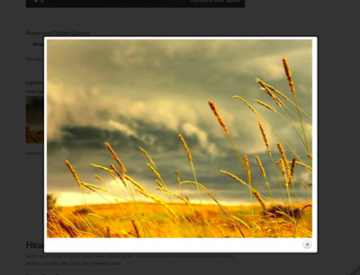
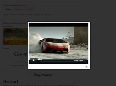
Using the Lightbox
The lightbox we are using is called "prettyPhoto". You can find out more about the prettyPhoto lightbox here. All of the Javascript for the lightbox is located in the "script.js" file in the /js folder.
Image Lightbox
Activating an image is simple as adding a rel="prettyPhoto" like so:
<a href="images/demo/portfolio-full-size1.jpg" rel="prettyPhoto" >
	<img src="images/demo/lightbox-thumb.jpg" width="150" height="150" alt="slideshow" />
</a>
Note: The caption is in the title="" tag and you can remove that if you don't want it of course.
Video Lightbox
Adding a video is exactly the same with the rel="prettyPhoto" tag. You don't need any embed code, just link directly to the vimeo or youtube page.
<a href="http://vimeo.com/22884674" rel="prettyPhoto" ">
	<img src="images/demo/lightbox-video.jpg" width="150" height="150" alt="slideshow" />
</a>
Creating a lightbox gallery (Next/Previous buttons)
Grouping images into a lightbox gallery is simple as well. The only additional step involves naming your gallery like so: [pp_gal]. Then place that code in tags like rel="prettyPhoto[pp_gal]":
<a href="images/demo/portfolio-full-size1.jpg" rel="prettyPhoto[pp_gal]"  title="You can add caption to pictures.">
	<img src="images/demo/lightbox-thumb.jpg" width="150" height="150" alt="slideshow" />
</a>
Contact Map / Flickr
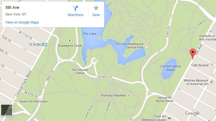
Embedding a map (contact pages)
It's simple to add an embedded map. First, you'll need to go to Google Maps and search for your desired location. Next, you'll need to copy the embed code, found by clicking the gear/wheel on the bottom of the page, and then click on 'Share and embed map'. The last part would require to just go to the contact.html file and add the code inside the map-progression div:
	<div id="map-progression">
		<iframe src="https://www.google.com/maps/embed?pb=!1m14!1m8!1m3!1d3021.436848951956!2d-73.9656126!3d40.774409299999995!3m2!1i1024!2i768!4f13.1!3m3!1m2!1s0x89c258a29d3847f5%3A0x564dfbba0141774a!2s5th+Ave%2C+New+York%2C+NY%2C+USA!5e0!3m2!1sen!2sbe!4v1411556637165" frameborder="0"></iframe>
	</div>
Note: You can adjust the height of the map by editing the style.css file and the #map-progression dimensions.
Setting Up the Flickr Widget
In order to add your Flickr account in the footer, you'll need to edit your script.js file which is located in the /js/ folder. You should be able to see this line in there:
$.getJSON("http://api.flickr.com/services/feeds/photos_public.gne?id=52617155@N08&lang=en-us&format=json&jsoncallback=?", displayImages); //YOUR IDGETTR GOES HERE
The only part you'll have to change is this ID: 52617155@N08
Contact Form
You can easily edit the default contact form from the live preview. There is an auto form validation plugin already activated, so all you need to worry about is to set the action of the form to send you an email once submitted. If you need a more complicated form, you can do this by using the free third party applicaiton WuuFoo.com. You can register free and create more advanced forms. You can then grab the "javascript embed" code and drop it onto the contact.html instead of our example.
Customizations
We do not offer support for customizations. However here are some tips on make some basic changes.
Note: We are available for hire via our website. Just fill out our contact form with your project details.
Responsive layout
This site is beautiful at any size, be it a 17" laptop screen or an iPhone. All of the styles for the responsive layout are located here: /css/responsive.css
The responsive grid is controlled via "Media Queries". Magnolia uses media queries to serve the scalable grid, but also for the convenience of styling your site on different size screens. Magnolia's media queries are almost exclusively targeted at max and min widths rather than device sizes or orientations. The advantage of this is browsers and future mobile devices that don't map to exact set dimensions will still benefit from the styles. That being said, all of the queries were written to be optimal on Apple iOS devices. The built in media queries include:
- Smaller than 960: Smaller than the standard base grid
- Tablet Portrait: Between 768px and 959px
- All Mobile Sizes: Less than 767px
- Just Mobile Landscape: Between 480px and 767px
- Just Mobile Portrait: Less than 479px
Example:
/* #Media Queries
================================================== */

  /* Smaller than standard 960 (devices and browsers) */
  @media only screen and (max-width: 959px) {}

  /* Tablet Portrait size to standard 960 (devices and browsers) */
  @media only screen and (min-width: 768px) and (max-width: 959px) {}

  /* All Mobile Sizes (devices and browser) */
  @media only screen and (max-width: 767px) {}

  /* Mobile Landscape Size to Tablet Portrait (devices and browsers) */
  @media only screen and (min-width: 480px) and (max-width: 767px) {}

  /* Mobile Portrait Size to Mobile Landscape Size (devices and browsers) */
  @media only screen and (max-width: 479px) {}
How to disable the Responsive Ability
You can easily remove the responsive styling by removing the /css/responsive.css file.
If you remove this, you will need to add one line of CSS to your style.css file:
body {min-width:1250px;}
CSS Styling
We only have one CSS stylesheet and it is located in the main theme folder under style.css file. You can also find the responsive stylesheet in the /css/ folder..
Search
Site Templates do not come with the ability to search. We have included the search bar for if users would like to add a content management system or search engine script.
Search engine options:
- Use a content management sytem
- Purchase a simple search engine script
- Google custom search
Content Management
This site template is built to be used without a content management system. If you would like to convert the files to a content management system, we recommend:
We also have a WordPress version of this template here:
http://themeforest.net/item/frover-mutipurpose-wordpress-theme/8486009
PSD Files
I've included all of my design psds with this template:
- The original layered PSD Files
- Templates for site
If you'd like to change the logo in the header, open "logo.psd", make the necessary adjustments.
Sources and Credits
I've used the following images, icons or other files as listed.
- Social Icons
- Revolution Slider
- Flex slider
- Mobile Menu jQuery plugin
- Google Fonts
- Drop-Down Script
- HTML5 Boilerplate
- Skeleton Responsive Framework
- jQuery Contact Form
- Responsive Embedded Videos JavaScript
Once again, thank you so much for purchasing this template. As I said at the beginning, I'd be glad to help you if you have any questions relating to this template. No guarantees, but I'll do my best to assist. Feel free to rate my template as 5 out of 5 stars. If it's not a 5 of out 5, e-mail me and let me know what I can do to improve your experience.
Michael Garcia, mike@progressionstudios.com